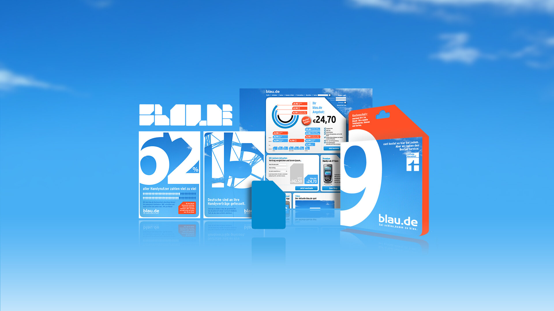
Blau.de – Redesign / Repositioning
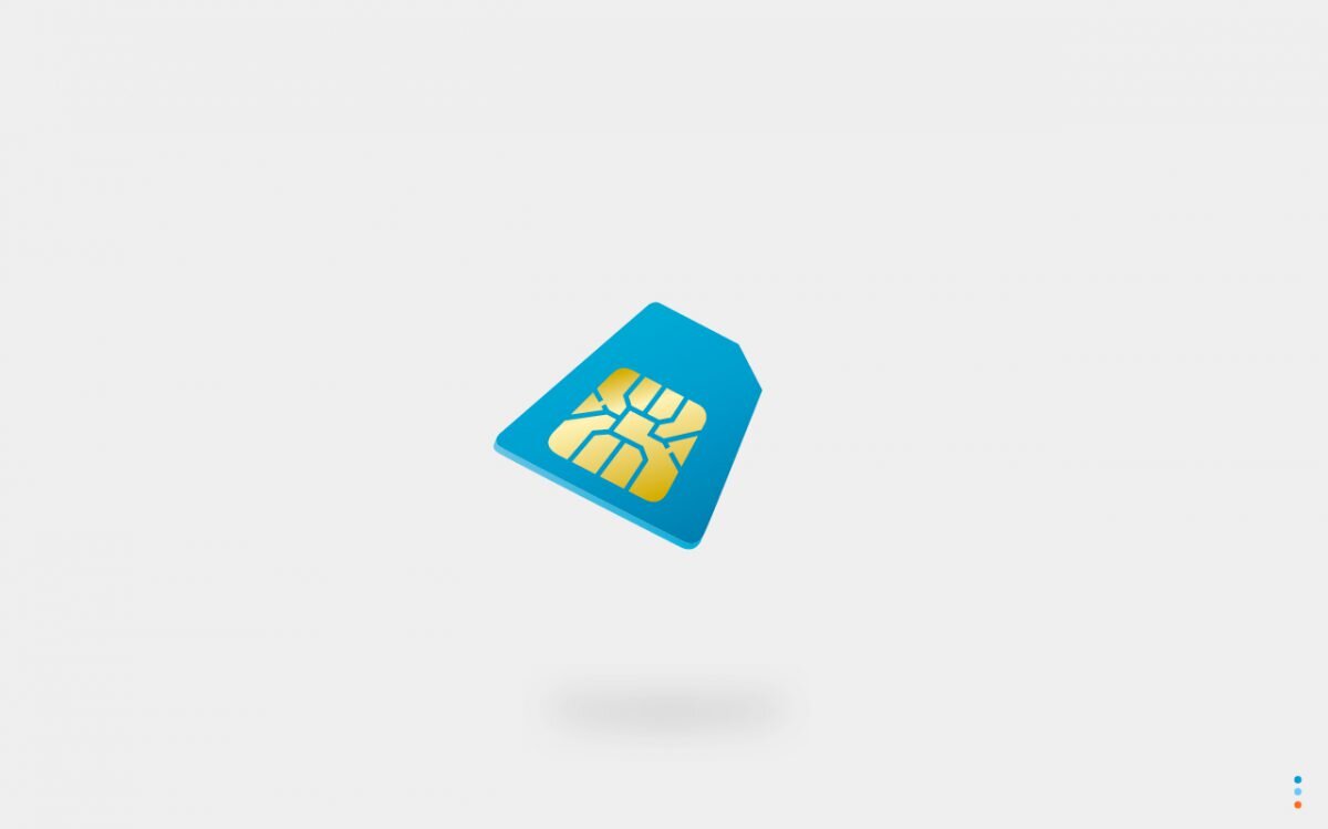
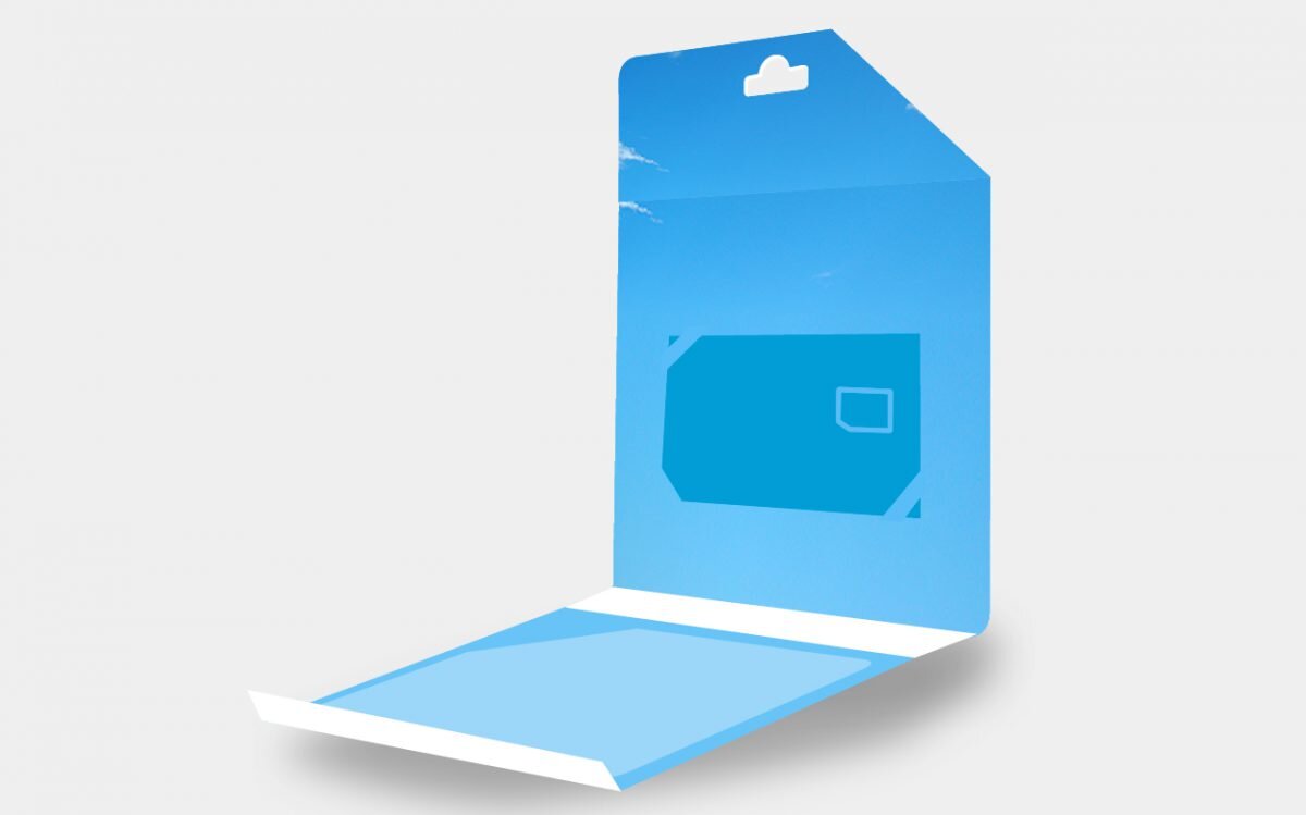
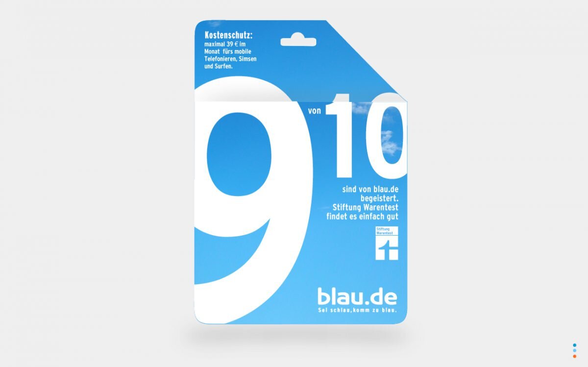
The telecommunications provider "Blau.de" rebrands itself from a cheapo to a high quality brand. We turned the iconic shape of the sim card into the core of the "Blau.de" brand, communicating the brand values, internationally understood in a single word - "Blau.de". The redesign included the Logo & CI, Packaging, Posters, Website, Banners etc.
Role
Brand Expert
Art Direction
Conception
Defining the brand
We turned the iconic shape of the sim card into the core of the brand.
Digital goes with it.
Even the website was created out of the iconic shape and convayed the „Blau.de“ message of change.
Thanks
for calling us
More projects
-
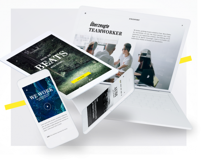
Strichpunkt Design
-
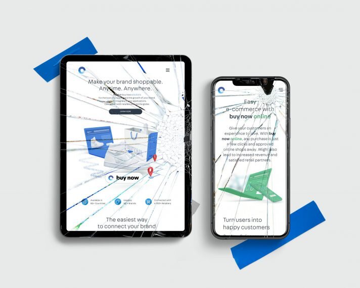
Commerce Connector
-

Deutsche Hospitality / Intranet


