Haselmeier Digital Transformation
Haselmeier is a leading german medical device manufacturer with a hundred-year tradition. Just like many others, Haselmeier was forced to take action due to the great technological and aesthetic challenges of digitalisation in the medical technology sector. We joined Haselmeier to support them in the digital transformation and to establish a fresh, contemporary communication both internally and externally. An aesthetically reworked product range, new colours and an outstanding CD/CI were just some of the measures we took during the 2 year transformation process.
Team
Corporate Design
Sheila Seyfert
UX / Concept / Consulting
Daniel Klipfel
Concept / Consulting / Text
Silke Schlüter
Consulting
Jana Piersdorf
Exhibition Concept / Consulting / Realisation
Albert Concepts
3D Design
Altelier Martini
Motion Design
Thuan Duc Bui

Redesign of a hidden Champion
Haselmeier is a very tradinional company a specialist in subcutaneous drug delivery since over hundret years. They came to us because they wanted to change the visual identity to a modern standards.


“NOVA” the color of
Haselmeiers progress
In order to preserve the culture and character of Haslemeier and to get it out of the dusty german medicine / pharmacy corner, we first of all defined a new central modern contemporary colour as a central measure.


A visual communiucation inline with Brand promise and corporate philospy and culture
We have also defined new illustrations, typography and image guidelines that give this cool and professional area a more human and open touch.
Away from „It’s a pity you feel bad, here’s your medicine“ to „Let’s stay fit and healthy together“.All in all, a sharp, professional and minimalist design was created, which stands for Haselmeier’s character and represents it in a modern and innovative look and feel.


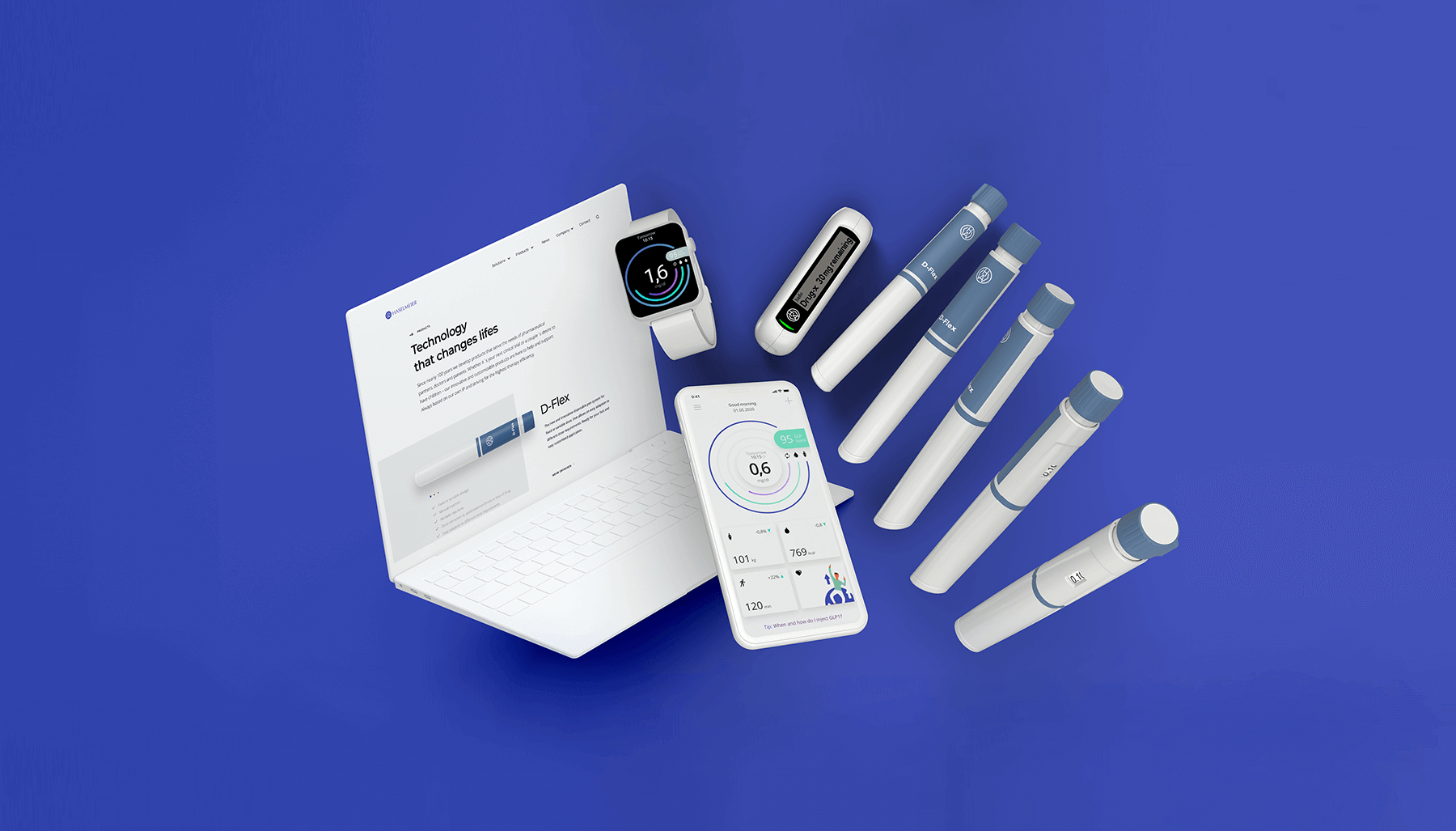
The Website
The natural centre of communication
The website as a natural centre of communication conveys a future-oriented approach in design, typography and user guidance.
The new products and services are the focus of the new website. The user is addressed in a consistently positive and modern way with the objectivity given for a B2B website. All information is available quickly and easily, and a contact person is never more than a click away.


The digital extension of a new product line
People with chronic illnesses such as diabetes or osteoporosis can enjoy a good quality of life when they routinely inject their medicine. While this fact may seem obvious, a lot of patients stop taking their medications within one year of being prescribed.
How can that be changed?
We created a user-friendly app that can increase medication adherence and supports better patient engagement and personal health management.
Clinical
Trial App


A fresh approach to guiding colors
We defined brand colors directions: One color schemes that represent the brand and one comes out of the products color spectrum. Therefore you get an easy-to-understand hierarchy in both printed matter and digital elements.

Primary colors
We decided to use colors that reflect the
working environment of the product.
So it came to the green and light gray
tones. The warm NOVA tone serves as a
contrast to the cool colors
Secondary
Colors

Logo Design
In addition, we simplifed the logo, so today it appears more contemporary, softer and significant.

Before

After

Logo Usage


Typography
We chose for the Montserrat typeface for its geometric but at the same time outspoken character without losing practicality, usability and scalability.

Brand building Illustrations
On the brand level, we decided on a clear, modern illustration style, without appearing kitchy, with important content and a strong message


Guiding Illustations
On the technical functional level, we decided on a more objective illustration style that is suitable, for example,
for illustrating and communicating content in apps or applications.


The Brand Manual
Haselmeier's new testament of corporate communication
We defined brand colors directions: One color schemes that represent the brand and one comes out of the products color spectrum. Therefore you get an easy-to-understand hierarchy in both printed matter and digital elements.


Stationary


For maximum flexibility
A wide range of promotional print products was created and detailed in the style guide for later use by 3.party agencies etc.
Exhibition flyer promoting the main therapy fields


From a medical tool to a lifestyle device
Small changes big effect. With a few minor tweaks such as adaption of the colouring, bandarole, logo and typography, we harmonize the D-Flex with the general new appearance and turne it into a more modern and friendly product. From a medical tool to a lifestyle device.
Package Design
We convinced Haselmeier that today an exceptional packaging design and an outstanding unboxing experience make up a large part of the product experience. Together we developed an FAA standards compliant experience that is unparalleled in the product environment


A stand adapted to the conditions of the medical trade fairs that is second to none

Together with Albertconcept, we developed a unique modular exhibition stand that attracts attention at every medical trade fair with its simple mid century design in combination with the new Haselmeier CD/CI. We placed a special focus on good usability and sufficient storage space in the design


Large typography, clear messages, integrated multimedia presentation and the statement transported by the general fresh design: „something has changed at Haselmeier“ make the exhibition stand a powerful tool for B2B communication
Exhibition video walls

Thanks for
healthy transforming
with us
More projects
-

Deutsche Hospitality
-

iCrates App & Magazine
-
Triad Website