
LRNIT // Brand Development
In early 2024, when Felix Meinhold and his team of exceptional programmers and entrepreneurs sought our expertise, LRNIT was just a nascent idea. Embracing this challenge, we at GPUNK formed a specialized team to work alongside them. Through intense collaboration and our hyper-flexible approach, we not only named and branded this venture but also defined its core identity.
With our sprint system, LRNIT's digital presence was realized swiftly, embodying a revolutionary vision for learning through code. This case exemplifies our ability to turn groundbreaking ideas into reality, setting a new standard in the ed-tech sector.
Team
Design & UI:
Gunnar Menzel
Tone of Voice & Copy:
Team GPUNK
Projetmanagment
Bettina Frohn
Courageous clients
Felix Meinhold
Identity Redefined
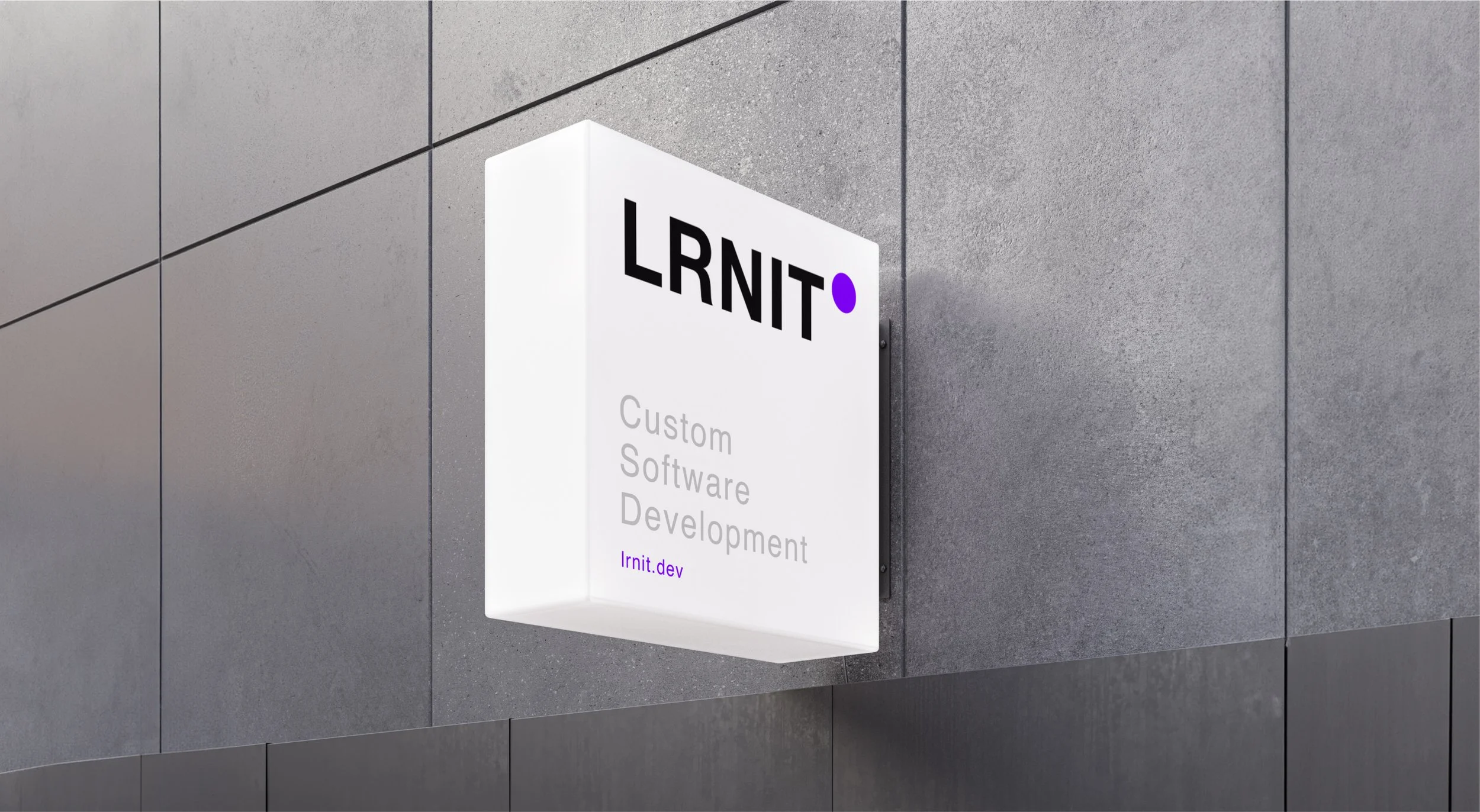
Maximum Flexibility with a Bold, Minimalist Approach
In crafting LRNIT's logo, we focused on stark simplicity and a strong exclamation point, versatile enough to range from name initials to new software titles. This design offers the necessary flexibility for future brand expansions, embodying a clear, memorable identity.

Timeless Flexibility Meets Modern Needs through Typographic Clarity
For LRNIT, we chose Helvetica Neue, ensuring utmost flexibility and widespread compatibility. This typographic classic guarantees seamless integration across various platforms, while its popular status adds a familiar touch to our brand's communication. This choice reflects our commitment to clarity, ease of reading, and a design that stands the test of time, aligning perfectly with LRNIT's innovative yet approachable ethos.

Helvetica Neue Bold

Helvetica Neue Regular
Helvetica Neue Light


A Website That Speaks Volumes
Simplifying Complexity with Intuitive Design
LRNIT's website stands as a paradigm of modern, highly responsive web design. It skillfully balances the presentation of complex, technical content with an easy-to-understand, user-friendly interface. This delicate equilibrium ensures that even the most intricate aspects of LRNIT's offerings are conveyed in an accessible and emotionally resonant manner. The site's intuitive structure and clear communication style empower users to grasp sophisticated concepts effortlessly, embodying the essence of LRNIT's innovative approach to e-learning.

Fresh Hues, Minimalist Use
In defining LRNIT's color scheme, we embraced fresh, modern colors, applying them sparingly for maximum impact. This approach not only highlights key elements with vibrant accents but also maintains a clean, uncluttered aesthetic. Our thoughtful use of color enhances the brand's contemporary feel while ensuring that every visual touchpoint remains focused and effective. This strategy aligns perfectly with LRNIT's vision of simplicity and elegance in the digital learning sphere.


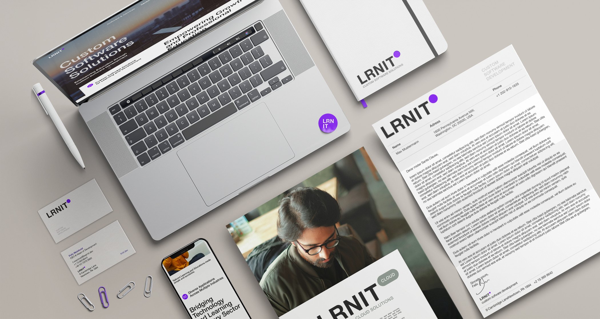
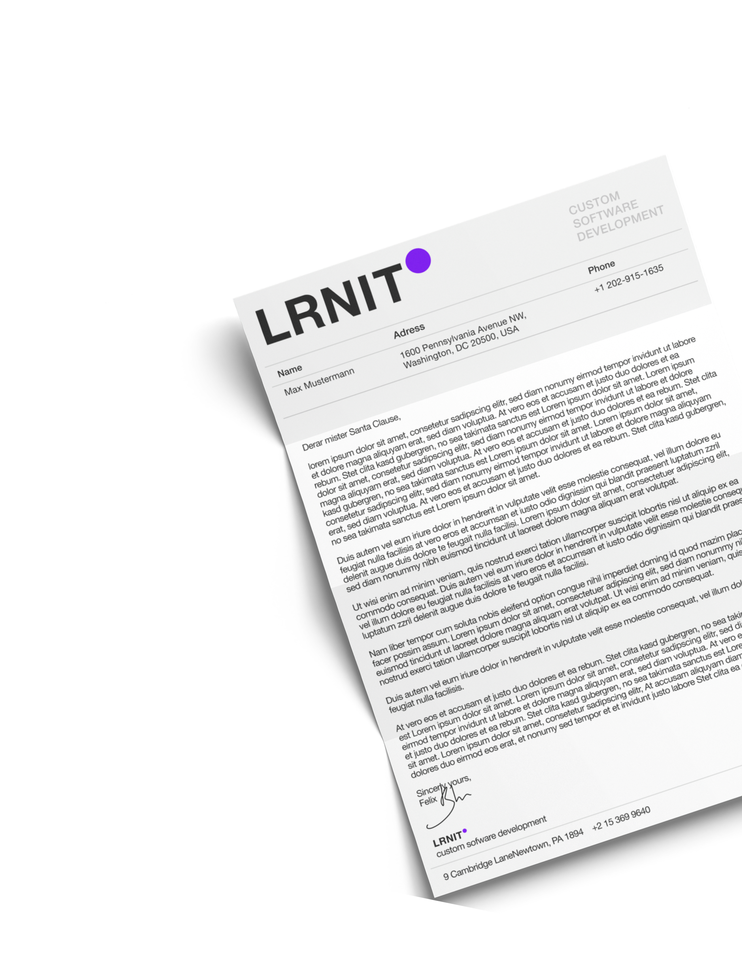
Streamlined Stationery and Imagery
Functionality Meets Visual Appeal
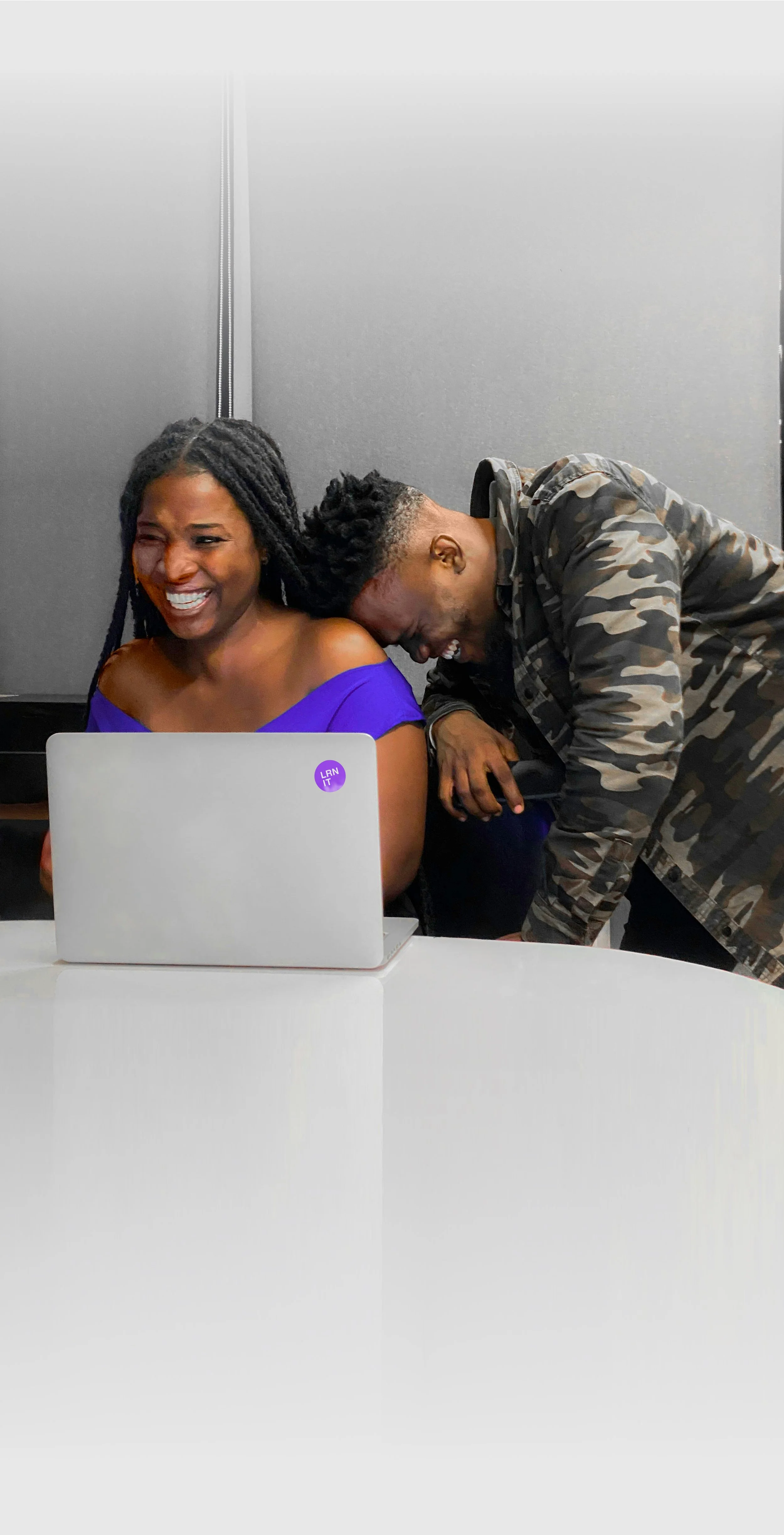
LRNIT's stationery design mirrors the elegance and simplicity of Google's tools, ensuring both functionality and a consistent aesthetic. This minimalist approach extends to our image selection, where modern, approachable visuals are sourced predominantly from free image platforms. This strategy not only maximizes cost-efficiency but also ensures a high degree of flexibility, allowing the brand to adapt and evolve visually without constraints. The result is a cohesive, relatable, and efficient visual identity that aligns with LRNIT's forward-thinking ethos.


A Full Suite of Brand Tools
Comprehensive Branding Across All Mediums
Our collaboration with LRNIT extended to creating a full spectrum of branding tools, ensuring brand consistency across every touchpoint. From meticulously designed email footers to a variety of marketing materials, every element was crafted to reflect LRNIT's identity. Video call backgrounds, stickers, T-shirts, signs – each item was thoughtfully designed to enhance brand visibility and recognition. This comprehensive approach ensures a unified brand experience, whether online or offline, fostering a strong and cohesive brand presence in every interaction.

Thanks
for learning
with us !!!
More projects
-
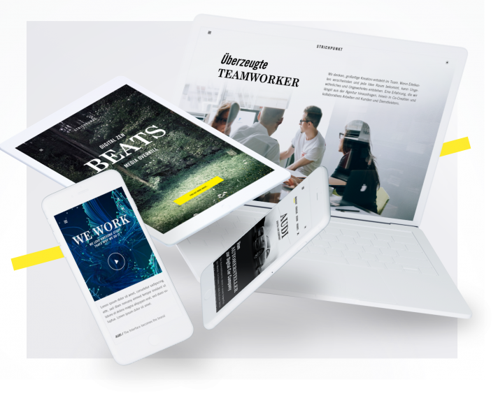
Strichpunkt Design
-
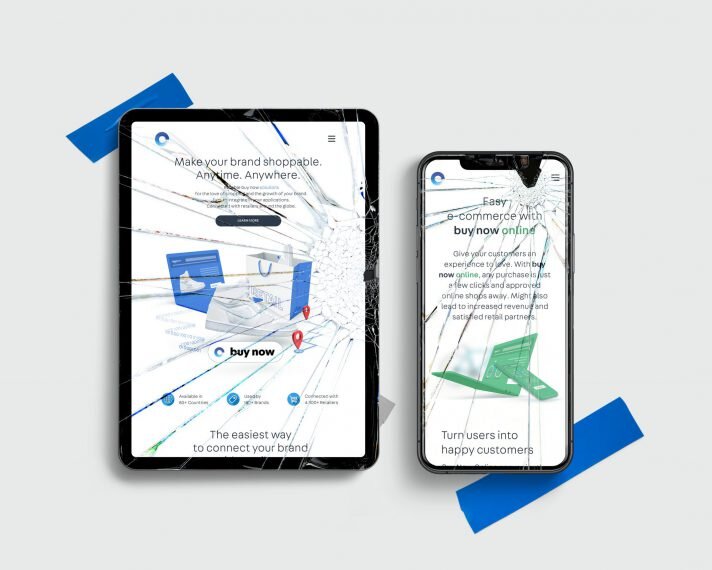
Commerce Connector
-

Deutsche Hospitality / Intranet